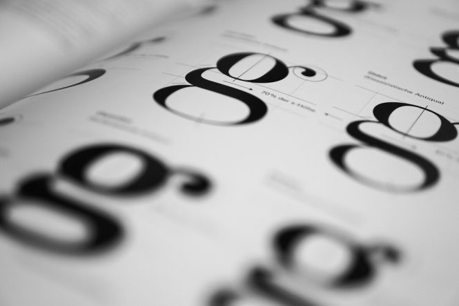
Read Between the Lines: The Power of Negative Space in Typography
When it comes to typography, we often focus on the visible elements – the letters, words, and characters that make up the text. However, there’s another crucial aspect of typography that can greatly impact the overall design and message: negative space. Also known as white space, negative space refers to the empty areas between and around the characters, lines, and other design elements. In this article, we’ll explore the power of negative space in typography and how it can elevate your design to the next level.
What is Negative Space?
Negative space is the area between and around the design elements, including the space between lines of text, the gaps between letters, and the margins around the text. It’s the “empty” space that provides a visual break and helps to create a clear and readable design. Negative space is not just a absence of content, but a deliberate design choice that can greatly impact the overall aesthetic and usability of the text.
The Importance of Negative Space in Typography
Negative space plays a crucial role in typography because it:
- Improves Readability: By providing a clear visual break between lines and characters, negative space makes it easier for readers to focus on the text and understand the message.
- Creates Hierarchy: Negative space can be used to create a visual hierarchy, guiding the reader’s attention to the most important elements of the design.
- Enhances Legibility: By providing sufficient space between lines and characters, negative space can improve the legibility of the text, making it easier to read, especially for people with visual impairments.
- Adds Emphasis: Negative space can be used to draw attention to specific elements, such as headings or calls-to-action, by creating a sense of isolation and focus.
- Creates Balance: Negative space can help to balance the design, creating a sense of harmony and stability by offsetting the visual weight of the text.
Types of Negative Space in Typography
There are several types of negative space in typography, including:
- Line Spacing: The space between lines of text, which can be adjusted to improve readability and create a sense of rhythm.
- Letter Spacing: The space between individual letters, which can be adjusted to improve legibility and create a sense of flow.
- Word Spacing: The space between words, which can be adjusted to improve readability and create a sense of separation.
- Margin: The space around the text, which can be used to create a sense of isolation and focus.
Best Practices for Using Negative Space in Typography
To get the most out of negative space in typography, follow these best practices:
- Use sufficient line spacing: Aim for a line spacing of at least 1.2 to 1.5 times the font size to improve readability.
- Adjust letter spacing: Use a letter spacing of around 0.1 to 0.2 times the font size to improve legibility.
- Balance word spacing: Use a word spacing of around 0.2 to 0.5 times the font size to create a sense of separation.
- Use margins wisely: Use margins to create a sense of isolation and focus, but avoid using too much margin, as it can make the text feel disconnected.
- Experiment and iterate: Don’t be afraid to experiment with different amounts of negative space to find the perfect balance for your design.
Conclusion
Negative space is a powerful tool in typography that can greatly impact the overall design and message. By understanding the importance of negative space and using it effectively, designers can create typography that is not only visually appealing but also easy to read and understand. Remember to use sufficient line spacing, adjust letter spacing, balance word spacing, use margins wisely, and experiment with different amounts of negative space to find the perfect balance for your design. By doing so, you’ll be able to create typography that communicates your message with clarity and style.