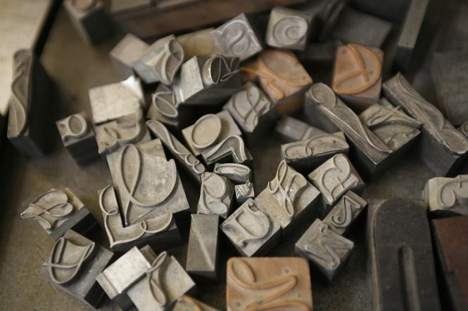
The Master Typographers: Lessons from the Greats on Crafting Beautiful Type
Typography is an art form that has been refined over centuries, with master typographers leaving an indelible mark on the world of design. From the elegant script of William Caslon to the modernist sans-serifs of Paul Renner, the great typographers have taught us that beautiful type is not just a matter of aesthetics, but a key element in communicating ideas and emotions. In this article, we’ll delve into the world of master typographers, exploring their contributions, philosophies, and techniques, and what we can learn from them about crafting beautiful type.
The Foundations: William Caslon and the Golden Age of Typography
William Caslon, an English typefounder and printer, is often credited with creating the first truly English typeface, Caslon, in the early 18th century. His design, with its elegant serif and refined proportions, set the standard for typography in the English-speaking world. Caslon’s work laid the foundation for the Golden Age of Typography, a period of unprecedented innovation and creativity in type design. Other notable typographers of this era include John Baskerville, who developed the first sans-serif typeface, and Giambattista Bodoni, whose eponymous typeface remains a classic to this day.
The Modernists: Paul Renner and the Bauhaus Movement
The early 20th century saw the rise of modernism, a design movement that sought to break free from traditional forms and explore new ways of communicating. Paul Renner, a German typographer, was a key figure in this movement. His typeface, Futura, introduced in 1927, was a radical departure from traditional serif faces, with its clean lines, geometric shapes, and sans-serif design. Renner’s work, along with that of other Bauhaus designers like László Moholy-Nagy and Herbert Bayer, paved the way for a new era of modernist typography.
The Digital Age: Matthew Carter and the Revival of Traditional Type
The advent of digital technology in the 1980s revolutionized the world of typography, allowing designers to create and manipulate typefaces with unprecedented ease. Matthew Carter, a British typographer, was one of the first to exploit this new technology. His typeface, Georgia, designed for Microsoft in the 1990s, was a digital revival of traditional serif faces, with its elegant proportions and refined detailing. Carter’s work, along with that of other digital pioneers like Jonathan Hoefler and Tobias Frere-Jones, has ensured that traditional typefaces continue to thrive in the digital age.
Lessons from the Greats: Principles of Beautiful Type
So what can we learn from the master typographers about crafting beautiful type? Here are a few key principles:
- Legibility: Beautiful type is, above all, legible. A well-designed typeface should guide the reader’s eye through the text with ease.
- Proportion: The proportions of a typeface are crucial to its beauty. A harmonious balance of x-height, ascender, and descender creates a visually pleasing and readable typeface.
- Contrast: Contrast is essential to creating visual interest in a typeface. A combination of thick and thin strokes, or serif and sans-serif elements, adds depth and variety to a design.
- Context: Typefaces are not created in isolation, but in response to the needs of a particular project or audience. A beautiful typeface is one that is tailored to its context.
- Craftsmanship: Beautiful type is the result of careful craftsmanship and attention to detail. A well-designed typeface is a testament to the skill and dedication of its creator.
Conclusion
The master typographers have left us a rich legacy of beautiful type, and their lessons continue to inspire and inform designers today. By studying their work and principles, we can create typefaces that are not only aesthetically pleasing but also effective in communicating our ideas and emotions. Whether we’re working in traditional or digital media, the art of typography remains a vital part of our design practice, and the master typographers remain our guides and mentors. As we continue to push the boundaries of what is possible with type, we would do well to remember the wisdom of the great typographers, and strive to create beautiful type that honors their legacy.